
Creating a Home in Harmony using Colour Theory Learnings
We don't know about you, but how our home looks, feels, and smells affects our mood. From joyful scent to calming colours, it all has an impact.
So, we’ve teamed up with our friends at YesColours to help you create a home in harmony. Scroll for expert tips on colour curation to support your well-being.
YesColours on using Colour Theory in the Home
It’s a busy world out there. We’re all still carrying a little ‘emotional baggage’ from the endless lockdowns, the change of pace we’ve collectively experienced and the new reality we got to meet without any notice. Whether we work from home or not, we all experience stress on a daily basis and we’re all striving for a harmonious life where we could sit back, relax and simply feel… at home.
Colour is an incredible tool to improve our wellbeing and mental health state, and it’s a proven method that’s contributing towards a more relaxed, balanced and zen lifestyle. It’s not magic but it’s pretty close, we promise. Here are a few tips and tricks on using colour theory to create a home in harmony.
- Use soft and restful colours.
The paint colours you choose hold immense power to influence our emotions and mental well-being. Softer pale paint colours, characterised by their delicate and muted hues, have gained significant popularity for their ability to create a serene environment in various spaces, especially in bedrooms, kitchens, and utility rooms. This deliberate selection of these calmer, softer paint colours not only transforms the visual appeal of these spaces but also deeply impacts our mood, stress levels, and overall mental health.
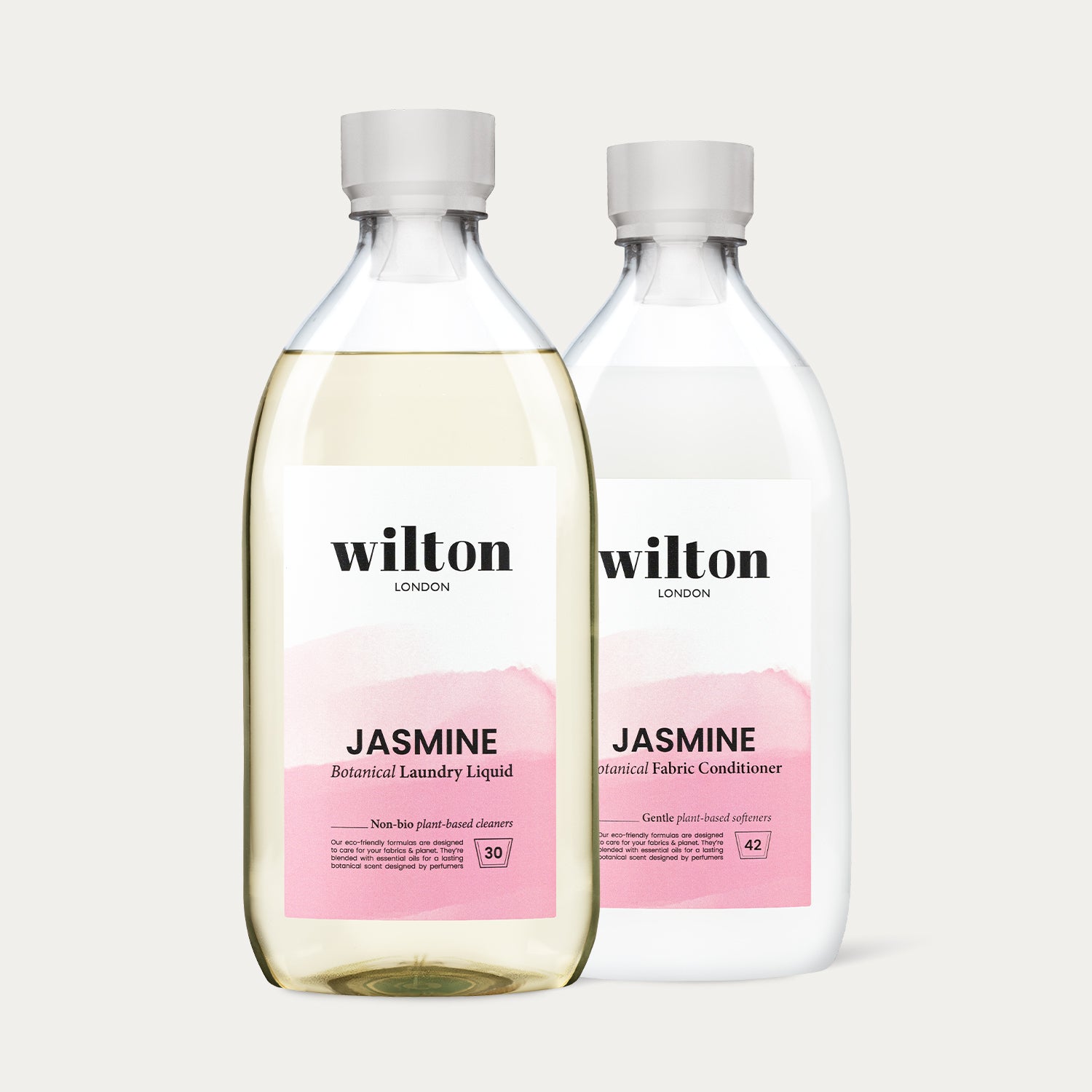
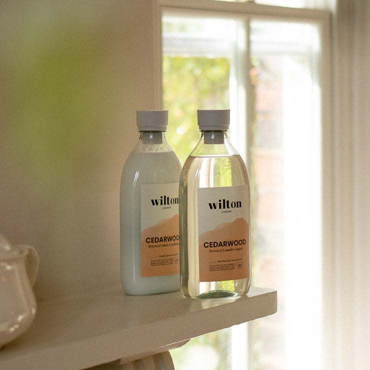
- Consider the fragrance you’re surrounding yourself with.
The psychological impact of colour and fragrance is well-documented, and it's widely recognized that our surroundings influence our mood and mental state. Softer, paler paint colours and natural relaxing fragrances specifically cater to our innate desire for a peaceful environment, allowing us to find moments of respite from the chaos of modern life. They soothe the senses, reduce anxiety, and create a visually pleasing ambiance that contributes to an improved sense of overall well-being. Additionally, colours and fragrance can promote mindfulness, encouraging us to be present in the moment and fostering a positive outlook on life.
- Create a relaxing bedroom.
The bedroom is a sanctuary where we retreat to rejuvenate and find solace from the demands of everyday life. By adorning bedroom walls with soft pale paint colours such as light blues (YesColours’ Serene Blue and Graceful Aqua), gentle greens (YesColours’ Graceful Green), subdued greys (YesColours’ Friendly Neutral), or blush pinks (YesColours Calming Pink and Serene Pink), a calming and tranquil atmosphere is effortlessly achieved.
These colours evoke a sense of serenity reminiscent of natural landscapes or soft morning skies, helping to lower stress levels and promote a restful sleep environment. The gentle tones also encourage relaxation, essential for preparing the mind for sleep and maintaining overall mental well-being.

Bedroom corner painted with YesColours’ Graceful Green.
- Nourish the heart of your home.
The room that’s often considered the heart of a home - the kitchen, is a space where culinary creativity and nourishment flourish. Incorporating soft pale paint colours into the kitchen design fosters a harmonious blend of comfort and functionality. Subtle pastels, warm creams (YesColours’ Calming Neutral), or pale yellows (YesColours’ Fresh yellow or Mellow Neutral) can infuse the kitchen with an air of positivity and warmth, making meal preparation a more pleasurable experience. These colours also stimulate creativity and encourage mindfulness while cooking, as the subdued tones provide a canvas for culinary exploration without overwhelming the senses.

A bright and relaxing kitchen painted with YesColours’ Serene Peach colour.
- Elevate the mundane tasks.
Utility rooms, despite their utilitarian purpose, can benefit greatly from the application of soft pale paint colours. Often associated with mundane chores, these spaces can be transformed into zones of calm efficiency with the right colour palette. Soft greys (YesColours’ Joyful Neutral), muted beiges (YesColours’ Loving Neutral), or pale lavenders (YesColours’ Graceful Lilac) can soften the utilitarian aesthetics and introduce a touch of tranquillity. This simple adjustment can mitigate the stress often linked to household tasks, enhancing our overall sense of well-being.
The choice of gentled toned paint colours in bedrooms, kitchens, and utility rooms is not just a matter of aesthetic preference, but a conscious decision to nurture our mental health and well-being. By harnessing the power of colour psychology, these spaces can be transformed into havens of serenity, where we can find solace, creativity, and comfort amidst the demands of daily life.